- CI (Corporate Identity)
- It means the work of visually organizing or unifying the image of a company or a public organization. The CI of Korea District Heating Corporation consists of symbol mark, signature, character, colors, and fonts.
Symbol mark
The symbol mark of Korea District Heating Corporation is a key element of its CI and is an active and dense symbol of building a single visual image of the management strategy to become "whole as one" and "one as a whole." The formative composition combines the shape of circle and a pipe, symbolizing the sun with a simplified straight line. The shape of the pipe resembles the shape of waves to give the impression of the rising sun on the sea; as a concept of new energy, it can be said to be reminiscent of the word "E" in the head of Energy.
Logo type
Along with the symbol, the logo type is a basic element of Korea District Heating Corporation's CI, which was developed to harmonize best with the image of the symbol. It is designed to be identified clearly with other companies and to focus on friendliness and softness considering the harmony with the symbol in order to solidify the image of the corporation.
Signature
The signature of Korea District Heating Corporation is an effective combination of the unified image formation of the corporation and symbol mark and logo type as the basic elements of CI. In principle, it shall be used in a suitable form according to functions such as signatures, promotional materials, and document forms of the corporation.
Brand Slogan
In principle, the slogan is applied as a top priority in the development of all visual productions of the corporation. Therefore, careful attention must be paid when using the word mark, and when using it, the data contained in the manual or original AI file must be used.
Character (Tasomi)
The character of Korea District Heating Corporation symbolizes the future energy that expresses and conveys trust and familiarity as a public company based on the image of warmth and cleanliness and delivers comfort through service and practice. The round face symbolizes the sun—which is the source of clean energy—and the body of the bee represents the energy transfer of Korea District Heating Corporation. The overall image shows the business area of Korea District Heating Corporation, which wishes to share warm energy.
Graphic motif
The graphic motif is a component that further enriches the identity system of Korea District Heating Corporation by complementing its symbol and logo type. In principle, the graphic motif is to be cut and used according to the example presented and by referring to templates and applications.
Emblem
The corporate color is the core element of Korea District Heating Corporation’s CI along with the symbol and logo type, forming the image of Korea District Heating Corporation. Symbolizing the sun and energy and representing an active and enterprising image, the corporate color is mainly used in symbol and English abbreviation logo type as well as in the color representation of applications. The corporate color should be expressed by separate processing; when four-color process printing is required, however, it should be expressed in accordance with the CMYK printing color regulation presented. In color representation, there may be slight differences in color reproduction depending on the nature of the medium, but be sure it is the closest color representation of the colors given in the example.
Color
The corporate color is the core element of Korea District Heating Corporation’s CI along with the symbol and logo type, forming the image of Korea District Heating Corporation. Symbolizing the sun and energy and representing an active and enterprising image, the corporate color is mainly used in symbol and English abbreviation logo type as well as in the color representation of applications. The corporate color should be expressed by separate processing; when four-color process printing is required, however, it should be expressed in accordance with the CMYK printing color regulation presented. In color representation, there may be slight differences in color reproduction depending on the nature of the medium, but be sure it is the closest color representation of the colors given in the example.
Font (KDHC Font)
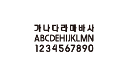
Korean District Heating Corporation owns the copyright to its font, "KDHC Font." Please obtain permission for commercial use.
